
About this Event
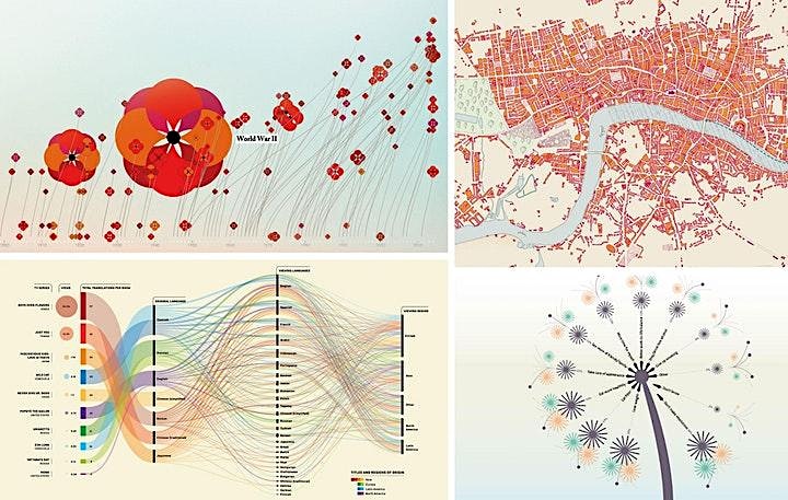
Dataviz and infographic storytelling are fast-evolving graphic languages that are transforming design, data journalism and presentations. This online seminar provides an introduction to data visualisation’s potential as a storytelling medium as well as the principles behind the construction of effective and compelling visual displays of information.
Format
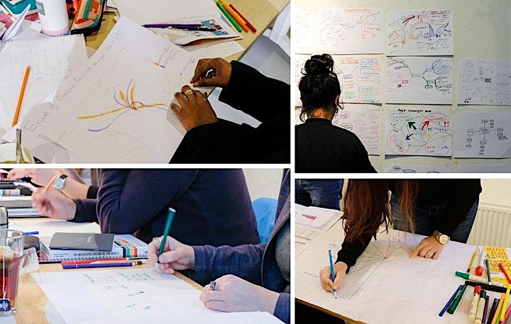
The content is delivered through a mix of teaching, discussion, and exercises across six hours of online interaction (two 3-hour sessions on consecutive days).
Attendees will work independently and in groups to address briefs with original visual solutions.
Topics covered include:
- The history and principles of data-driven storytelling
- Visual perception theory in practice
- The anatomy of an effective visual display of information
- Colour theory and usage
- Charting conventions
- The use of visual metaphors and semiotics applied to data encoding
- Linear and interactive storytelling
- Primary considerations: audience, purpose, medium
- An overview of selected digital tools
Objectives
The main goal of this workshop is to provide the knowledge and practical skills necessary to develop a strong foundation on information design.
Poorly designed presentations of data slow down decision-making, mislead your audience and can ultimately damage your brand. This workshop combines theoretical instruction with exercises in sketching and storyboarding to provide a detailed understanding of different aspects of decision-making that go into the creation of an effective data-driven narrative (infographic or dataviz).
Main objectives:
- Gain a clear understanding of why and how we visualise data
- Increase the sophistication of how to read and evaluate the effectiveness of visual displays of information, in order to create better briefs and/or give feedback effectively
- Learn how to maximise design for impact, understanding and memorability
- Identify best-fit solutions for data visualisation through a step by step process
- Build a vocabulary of terms to bring back into the workflow
Audience
The seminar is designed to accommodate up to 20 participants to allow group discussions and individual participation. It is ideal for people with an interest in telling stories through data and no design experience is required.
Attendees come from various backgrounds and sectors:
Data researchers, analysts, statisticians, journalists, marketers, students looking to enhance the creativity and impact of their communications through design
Designers or developers looking to get a better understanding of data-driven visual solutions
What you need:
- Basic drawing materials (pencil, pen, etc.)
- A smart phone to snap pictures of your sketches
- Access to a video camera and video conference
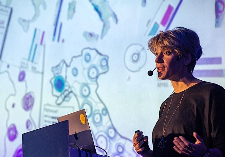
Valentina D’Efilippo is an award-winning designer, author, trainer and occasional speaker. Her passion for visual communication and digital media has taken form in data visualisation, art direction, and interaction design. She has worked with a number of leading agencies contributing to award-winning campaigns for global brands and in 2013 she published The Infographic History of the World – a collection of more than 100 uniquely designed infographics.
Since 2014, Valentina has been teaching Masterclasses for the Guardian and the V&A. She has trained teams globally for clients such as Google, Pfizer, UBS, OPEC, United Nations ILO, and the NHS.
Format
The content is delivered through a mix of teaching, discussion, and exercises across six hours of online interaction (two 3-hour sessions on consecutive days).
Attendees will work independently and in groups to address briefs with original visual solutions.
Topics covered include:
- The history and principles of data-driven storytelling
- Visual perception theory in practice
- The anatomy of an effective visual display of information
- Colour theory and usage
- Charting conventions
- The use of visual metaphors and semiotics applied to data encoding
- Linear and interactive storytelling
- Primary considerations: audience, purpose, medium
- An overview of selected digital tools
Objectives
The main goal of this workshop is to provide the knowledge and practical skills necessary to develop a strong foundation on information design.
Poorly designed presentations of data slow down decision-making, mislead your audience and can ultimately damage your brand. This workshop combines theoretical instruction with exercises in sketching and storyboarding to provide a detailed understanding of different aspects of decision-making that go into the creation of an effective data-driven narrative (infographic or dataviz).
Main objectives:
- Gain a clear understanding of why and how we visualise data
- Increase the sophistication of how to read and evaluate the effectiveness of visual displays of information, in order to create better briefs and/or give feedback effectively
- Learn how to maximise design for impact, understanding and memorability
- Identify best-fit solutions for data visualisation through a step by step process
- Build a vocabulary of terms to bring back into the workflow
Audience
The seminar is designed to accommodate up to 20 participants to allow group discussions and individual participation. It is ideal for people with an interest in telling stories through data and no design experience is required.
Attendees come from various backgrounds and sectors:
Data researchers, analysts, statisticians, journalists, marketers, students looking to enhance the creativity and impact of their communications through design
Designers or developers looking to get a better understanding of data-driven visual solutions
What you need:
- Basic drawing materials (pencil, pen, etc.)
- A smart phone to snap pictures of your sketches
- Access to a video camera and video conference
Valentina D’Efilippo is an award-winning designer, author, trainer and occasional speaker. Her passion for visual communication and digital media has taken form in data visualisation, art direction, and interaction design. She has worked with a number of leading agencies contributing to award-winning campaigns for global brands and in 2013 she published The Infographic History of the World – a collection of more than 100 uniquely designed infographics.
Since 2014, Valentina has been teaching Masterclasses for the Guardian and the V&A. She has trained teams globally for clients such as Google, Pfizer, UBS, OPEC, United Nations ILO, and the NHS.
More events you might like
 Read more
Professional Diploma in UX Design 2024
A unique 6-month university-accredited programme in UX for Designers and Creatives, combining online learning and live webinars to further develop business skills and build successful careers.
 Read more
Professional Certificate in UI 2024
Are your digital design skills holding you back? Master the key concepts and techniques of user interface design with this 3-month university-accredited programme in UI for Designers and Creatives, combining online learning and live webinars.
 Read more
Professional Certificate in Content Design 2024
Are your content design skills holding you back? Master the key concepts and techniques of content design with this 10-week university-accredited programme in Content Design for Designers, UX/UI Professional and Creatives, combining online learning and live webinars.
 Read more
Professional Certificate in User Research 2024
A unique 4-month university-accredited programme in User Research for Designers and Creatives, combining online learning and live webinars to further develop business skills and build successful careers.
 Read more
Certificate in Design for Sustainability and Circular Economies
Invest in the Future of your design practice and continue your professional development with a Certificate in Design for Sustainability and Circular Economies.
 Read more
Designs on Growth
An innovative learning and development response providing owner/managers with best practice business management skills to support sustainability and increase revenue in their business.